
What's going on with the IBM Sametime Branding?
Category Sametime Branding
With Sametime 8.5.2, many of us believed IBM had a small bug in their code with the login panel not having any kind of graphics or colouring, as can be seen here:
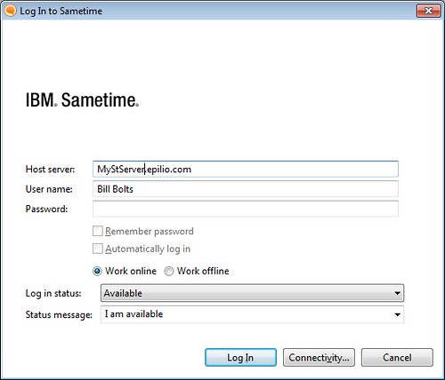
I'm suprised IBM didn't add the text "This space has been intentionally left blank"
The same cleansing process has now taken place with Sametime Proxy, so this is a conscious design decision by someone.
Before
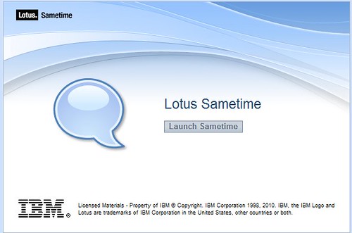
After
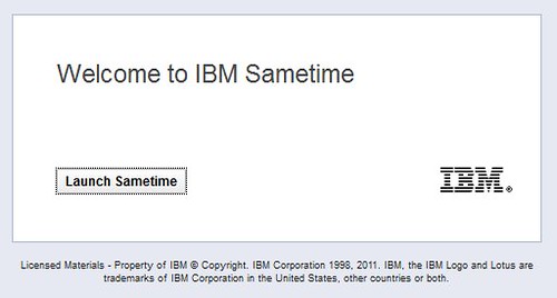
Which do you think looks better?
With Sametime 8.5.2, many of us believed IBM had a small bug in their code with the login panel not having any kind of graphics or colouring, as can be seen here:
I'm suprised IBM didn't add the text "This space has been intentionally left blank"
The same cleansing process has now taken place with Sametime Proxy, so this is a conscious design decision by someone.
Before
After
Which do you think looks better?
| Permalink | ![]()
![]()
![]()
Comments
Posted by IBM At 03:16:00 PM On 02/22/2012 | - Website - |
Posted by Klaus Bild At 02:31:44 AM On 02/23/2012 | - Website - |
However, given this is IBM with their legal team, no chance of that.
Posted by Stuart McIntyre At 02:36:36 AM On 02/23/2012 | - Website - |
Posted by Michael Bourak At 07:34:12 AM On 02/23/2012 | - Website - |
Agreed with the "get rid of the legal" comments. Are IBM the only ones who still have this stuff on their welcome screens?
The white is unimaginative and boring.
Posted by Mat Newman At 04:18:50 AM On 02/24/2012 | - Website - |