
Do your Notes 8.5 fonts appear fatter and fuzzier than earlier versions?
Category None
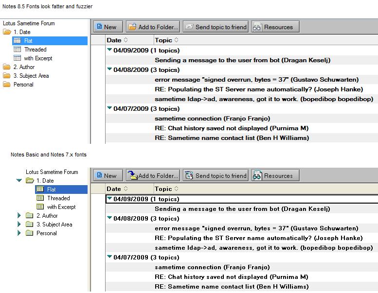
Maybe you hit the same thing I did. My move to Notes 8.5 involved moving to a new machine, my previous dual core with 2Gb ram just struggled with it too much. In the move I noticed the text on my workspace looked fuzzier and the text in views was different. It looked like Notes 8.5 views had put on some weight and they reminded me of the font used in the old OS/2 version of Notes. I was seeing the following differences:
It turns out the issue wasn't Notes 8.5 but was actually my Clear Type setting in Windows. I turn clear type off, as to be honest I find it makes the screen harder to read, even though it's intended to make it easier. To change your Clear Type setting, click right mouse button on an empty space in your Windows Desktop and click Properties, then click the Apperance tab and then the Effects button. For the option "Use the following method to smooth edges of screen fonts:" I use the option "Standard".
Making that change the fonts look a little less fat and definitely less fuzzy.
Now I need to figure out if there is some similar setting on the Mac, as I find the Notes 8.5 Mac views really hard to distinguish between bold and regular text.
| Permalink | ![]()
![]()
![]()
Comments
Posted by Chris Mobley At 04:13:10 PM On 04/09/2009 | - Website - |
Posted by Orlando Chacon At 11:40:54 AM On 04/10/2009 | - Website - |